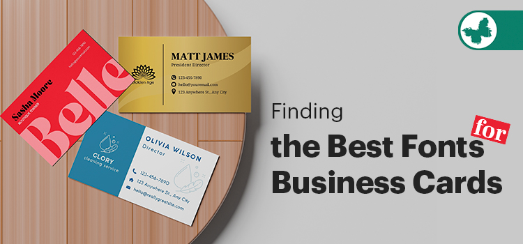
With its vivid representation of your professional identity, a business card is the ideal tool for networking. Choosing the right font is one of its most important components. One way to convey your brand’s voice and influence how readers view and interact with your content is through the use of perfect fonts. However, it can be challenging to find a font style that works well with your brand identity when there are thousands of different font styles available.
By introducing you to some of the best fonts for business cards, this blog post hopes to assist you in creating the most visually appealing marketing collateral. We will present the most widely used font style and discuss visually appealing font combinations for the premium attraction of this essential print product.
Read More: Best Fonts for Print: A Guide for Print Professionals
Contents
Best Fonts for Business Cards Design
Each company has a different ideal font for business cards that resonates with its audience and reflects its brand image. It takes strategy, imagination, and maybe a little intuition to choose the best fonts for business cards.
Traditional fonts like Arial, Helvetica, and Times New Roman are frequently used by businesses for their business cards. These are simple to read, but they’re also fairly generic and don’t really help your brand differentiate. Let’s review some of the beautiful and modern fonts available for business cards to grab the receiver’s attention efficiently.
Serif Fonts
Small decorative lines called serifs at the ends of the letter’s main strokes are what set serif fonts apart. The overall look and personality of the font are influenced by the size and shape variations of these serifs. In print media like books and newspapers, serif fonts are commonly used and are frequently linked to traditional, formal, and classic designs.
Garamond, Georgia, and Leyton are serif fonts that work well for business cards, especially if you want a classic or elegant style. These fonts are appropriate for fields like law, finance, and consulting because of their ability to project formality and authority through their tiny decorative strokes.
- Garamond: Known for its elegance and readability, even at smaller sizes, this classic serif font is a great option for business cards. It is particularly well-liked by traditional industries like law, finance, and consulting.
- Georgia: This font was created to be readable on low-resolution screens. It also looks good in print and provides a business card design that strikes a balance between sophistication and clarity.
- Leyton: This font style is a serif font that can give a business card a personal touch while still looking professional, though it isn’t as well-known as Georgia or Garamond.
Sans-Serif Fonts

Contrary to serif fonts, sans-serif fonts lack the tiny ornamental strokes known as serifs at the ends of letterforms. As a result, sans-serif fonts seem crisper, more contemporary, and simpler. Because they are readable and clear, they are frequently chosen for digital displays, headlines, and marketing signs.
Sans-serif fonts convey efficiency and clarity and are frequently linked to a modern, minimalist, and uncomplicated aesthetic. For business cards, where information must be quickly and easily understood, sans-serif fonts are essential due to their clarity and legibility.
- Helvetica: A popular and traditional sans-serif font, Helvetica is renowned for its simple design and clean lines.
- Arial: Another well-liked option that has excellent legibility and a clean, adaptable appearance.
- Lato: This is an updated sans-serif font that still looks professional but has a more approachable and friendly vibe.
Trendy and Modern Fonts
The sleek lines and adaptability of Montserrat and Raleway fonts make them great options for contemporary and stylish business cards. Raleway, which is also sans-serif, has a more refined and elegant feel, while Montserrat, with its geometric sans-serif design, offers a clean and professional appearance. Your business cards will stand out if you pair them to create an eye-catching contrast.
- Montserrat: This geometric, sans-serif font style is well-liked because it provides a crisp, contemporary look. It is ideal for both business card headings and body text because it is very readable. A clean and professional appearance is guaranteed by its uniform appearance. applications for tech firms, startups, and the creative industries, as well as projects that require a powerful visual impact.
- Raleway: Another sans-serif typeface with a reputation for sophistication and elegance is Raleway. Both headings and body text can use it because of its versatility. Combining this font with other typefaces, such as Montserrat, will produce an eye-catching contrast, which is perfect for companies looking to show a feeling of sophistication and modernity.
Read More: Top Business Card Design Trends for Canadian Businesses
How to Pair Fonts for Professional Business Cards?
When choosing fonts, you’d better consider the overall aesthetic of the brand. Then, decide which information should be displayed first in a visual hierarchy. You can design your name or brand name with a bigger font and make the remaining information, such as your social media handles and contact information, smaller.
You also have another option of adding a human touch. It can be easily conveyed by script fonts, which resemble handwritten calligraphy. While rounder scripts convey a sense of fun, classic, flowing scripts typically achieve an elegant look. Two of the most popular options for font combinations include:
- Roboto Slab in regular form, combined with Montserrat in bold form as the heading, creates visual interest without sacrificing readability or clarity. You can use the effectiveness of this combination on a business card design by applying Montserrat for the name, which is the most crucial element, followed by the contact details in Roboto Slab.
- Finding the ideal balance between professional and captivating is the key to creating effective business cards. Both Antonio and Lato Light are simple sans serif fonts, but you can easily create contrast by adjusting the density and size.
Antonio is a bolder sans-serif that can be used for names, headlines, or company titles, offering a strong visual contrast and hierarchy. Lato Light, with its stylish simplicity, is ideal for body text, such as contact information and details.
Tips to Use the Best Fonts for the Highest Efficiency
The dos and don’ts of selecting the best fonts for business cards are explained in the following tips. Keep in mind these crucial pointers:
- Instead of using creative fonts for the primary contact information, use them only for a tagline or a brief phrase to create visual interest. However, when scaled down to smaller sizes, script or intricate fonts may become unreadable. Your business card may appear cluttered and amateurish if you use too many creative fonts.
- To establish a visual hierarchy, use differing font sizes. Bigger and more noticeable fonts should be used for the most crucial information.
- Make sure that space and readability are balanced. Prospective employers or coworkers won’t be able to contact you if they can’t read your card! This is why selecting the ideal font at the beginning of your business card design process is crucial.
- Print a sample of your business card before deciding on your final design to make sure the fonts and colours you’ve chosen will look good at the real size. Consult with others about your layout and font selections.
- Don’t use more than three different font sizes on your business card, and don’t pair similar-looking fonts.
Read More: Business Card Quantity You Should Print As B2B Professionals
Conclusion
Your professional image is greatly influenced by the typeface you use on your business card. Making a lasting impression with business cards requires selecting a quality font, regardless of whether you choose a sophisticated, contemporary, or traditional design. However, there isn’t a one-size-fits-all solution; it all depends on your industry, goals, and personal preferences.
For professional advice on selecting the best fonts for business cards, you can also speak with Butterfly Graphics and Printing‘s skilled design and print teams. You can focus on other areas of your business while our team takes care of your wholesale print issues.