Choosing the right font is very important when creating print products. The font you pick can affect how easily people read and understand your content. It’s a big part of how your audience connects with what you’re sharing. Inaccurate font usage can happen in a variety of contexts, such as when reading a road banner at a distance, which will create a bad impression.
In this blog post, we will help print businesses choose the right font for print projects. We’ll talk about factors such as font sizes and categories that work well in print. We’ll also share the mistakes to avoid when choosing fonts for print to help you make smart choices. Keep reading to learn how to choose fonts for print.
Contents
Why Fonts Matter in Commercial Printing
The font you choose for print materials plays a significant role in how readers engage with the content. The right font can enhance readability and make a strong visual impact. It can also convey the personality of the brand and suit well with your target audience. Therefore, selecting the right font is essential for ensuring effective communication and capturing the attention of the viewers. Let’s explore the importance of the right font for print materials:
Impact on Readability
The font you choose for your print materials directly affects how easily the content can be read and understood. Fonts with good readability can enhance the overall user experience and ensure that the message is effectively communicated to the target audience.
Reflecting Brand Personality
The selected font can convey the brand’s personality, values, and identity. Whether it’s a modern, traditional, playful, or elegant image, the font you choose can shape the perception of the brand in the readers’ minds.
Aesthetics and Visual Appeal
Fonts can significantly impact the visual appeal of print materials. The right font can enhance the overall design, create a sense of harmony, and make the content more visually engaging, enhancing the overall attractiveness of the printed materials.
Consistency with Branding
Choosing fonts for print that align with a brand’s existing marketing materials is essential to maintain consistency across different communication channels. Consistency helps establish brand recognition and a distinct brand image.
Consideration of Medium
The medium in which the print material will be used should be considered when selecting a font. For example, a font that looks great on a large poster may not be as effective for a smaller brochure or business card. The size, resolution, and printing method can all affect the appearance of the font and should be considered.
Understanding Font Categories
Fonts are classified according to their stylistic traits in commercial printing; the most popular types are serif, sans-serif, script, and display/decorative fonts. Knowing these classifications makes it easier to select the ideal font for a given design requirement, guaranteeing both readability and aesthetic appeal. Here is a breakdown of the most popular commercial fonts:
- Serif Fonts: These typefaces have tiny, ornamental strokes at the end of each letter. The serif fonts are more conventional and help the reader’s eye move in a specific direction. Georgia, Garamond, and Times New Roman are a few examples. Most often, these are used for body text, where readability and legibility are essential.
- Sans-serif fonts: Give your work a fresh, contemporary appearance. In digital contexts and on screens, they are easier to read. Calibri, Helvetica, and Arial are a few examples of this category. These are mostly used for modern designs, logos, headings, and websites.
- Script fonts: They resemble handwriting’s flowing style. Script fonts are frequently used in imaginative and artistic designs and offer a personal touch. Brush Script MT, Comic Sans MS, and Copperplate are a few examples. Display elements, headlines, and logos are the main uses for this font category.
- Display/Decorative Fonts: Having an eye-catching appearance, they are useful for establishing visual hierarchy and adding distinction to a design. Some of the better-known examples include Lucida Sans, Impact, and Papyrus. Mostly, these are utilized for posters, banners, logos, and headlines.
Readability vs. Aesthetic Appeal: What Should You Prioritize?
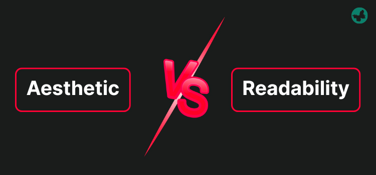
When designing a marketing product, readability is more important to a print company than aesthetics. However, the best way is to strike a balance between these two factors. But nobody can deny the fact that the main objective of printed products is to convey information efficiently and clearly. A design that is visually appealing but hard to read fails its purpose.
Tip: You can make a design that is both aesthetically pleasing and extremely readable. All you should do is choose readable fonts, make sure the text and background contrast enough, and use whitespace to prevent clutter.
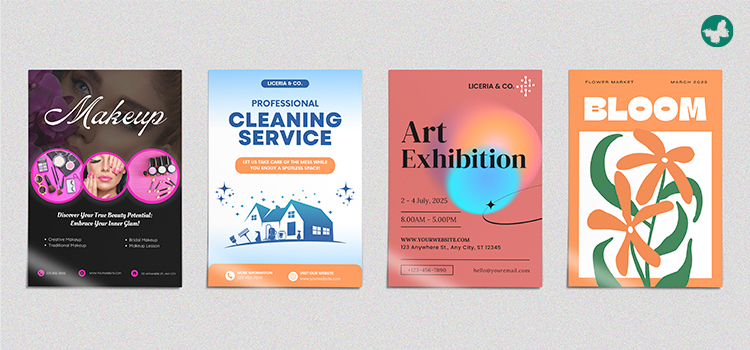
Choosing Fonts Based on Print Format
The font itself plays a big role in readability. While there are many fonts out there, not all are good for print. The best fonts for print have clean lines and are well-balanced, making them a great choice for different industries. Consider the following tips for the best font selection:
- Print Purpose and Context: Identify the print format. Is it a label, banner, poster, or business card? The required level of readability and detail depends on the purpose. The next influential factor is the age, background, and preferences of your audience. The context is also very important: is it serious, playful, elegant, or technical? The intended mood should be reflected in the font.
- Primary and Secondary Fonts: For your primary font, which is related to your body text, you must choose an easily recognizable and clear font. On the other hand, the secondary font, like headings, should have a bold and standout format. The proper match between these two fonts and brand identity is also an important factor.
- Contrast and Spacing: Make sure the font colour has enough contrast with the background colour to guarantee easy readability. Use the proper line spacing to avoid text overlapping. Change the font size based on the intended use and the type of print format.
- General Design Format: Fonts should complement one another and produce a harmonious, well-balanced overall design. Try a variety of font combinations to see which suits your particular print format and design the best. Don’t be afraid of doing some simple experiments!
Common Font Mistakes in Print Projects

Finalizing your design with specific fonts on a computer might have a different appearance in the bigger print format. You need to follow some instructions to avoid common mistakes in choosing the font for print products. Read the following probable mistakes and solutions:
- Unmatched Fonts: Selecting a series of fonts that are not matched with the tone, context, or print format results in useless efforts. Choose the right size, colour, background, and spacing for the utmost readability.
- Inconsistent Hierarchy: If your design lacks hierarchy, it will distract the reader from following the text. For a clear hierarchy, choose the font weight, size, colour, and placement carefully. It means that the body text, subheadings, and headlines should all be visually distinct.
- Lack of Alignment: Not considering the text and font alignment will sabotage the success of your whole print project. Not following alignment rules will result in a messy and sloppy design. For a neat and polished appearance, make sure the text is always aligned and fonts are spaced.
- Ignoring Bleed Zones and Safe Areas: If the bleed zones are not considered correctly, the final print will have a completely awful design. You need to keep using your fonts inside the safe zone to avoid overwhelming the viewer’s eyes. At least 3 mm of space is required for the bleed zone, and more space if you are designing large-format items.
Read More: Essential Print Design Terminology: Safe Zone, Trim, and Bleed Lines Explained
Conclusion
Choosing the right font for print materials is important for print businesses to connect with their audiences. By considering factors like font sizes, colours, and spacing, you can effectively communicate with a diverse audience. When choosing a font, remember to think about how it looks and if it suits your audience and the context. ButterflyGP has a long history of print business for different industries. So, you can trust our expert team for the right font and the best quality printed marketing materials.